Native-like PWA. Case study: heylinda-app
Table of Contents
To illustrate ideas from my previous article. Let’s take a look at heylinda-app. No hard feelings - it was first open-source ReactNative app compiled to PWA, that I found.
ReactNative was built specifically for mobile platforms, so it was interesting for me to see how it works for PWA.
| Feature | yes/no |
|---|---|
| Installable | yes |
| AppShell | kind of |
| Bottom navigation | yes |
| Offline support | no |
| Splash-screen | no |
| Over-scrolling fixed | no |
| Text-selection blocked | no |
| Smooth transitions/animations | no |
| Gestures | no |
| Dark theme | yes |
Detailed report #
| Comment | Screenshot |
|---|---|
| There is an icon. When launched from home screen, it opens in standalone mode. | 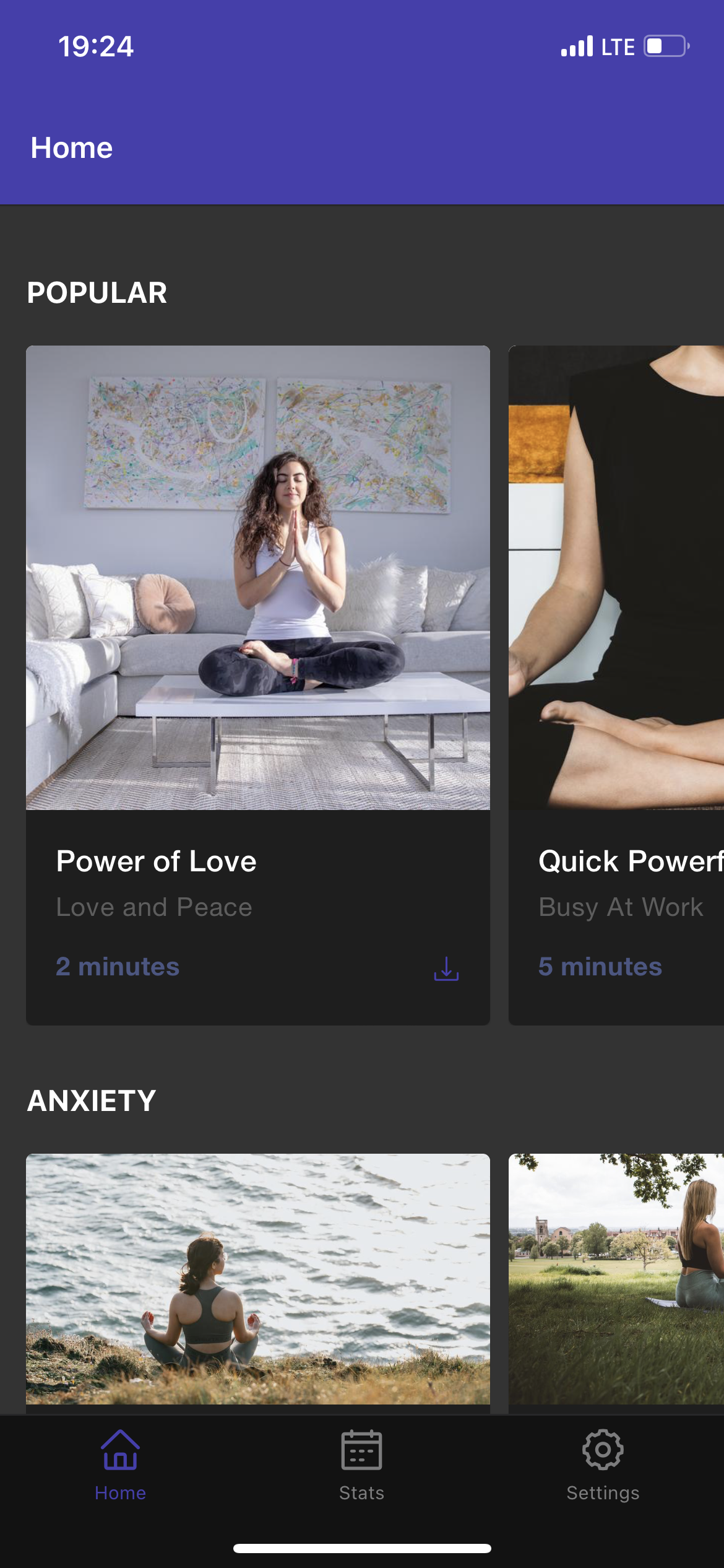 |
| There is header and bottom navigation bar. Which counts as AppShell, but there is no offline support. Fix: use ServiceWorker, for example workbox. |  |
There is no splash screen. Fix: use <link rel="apple-touch-startup-image" href="..." > |  |
Over-scrolling is possible. Fix: html { overscroll-behavior: none; | 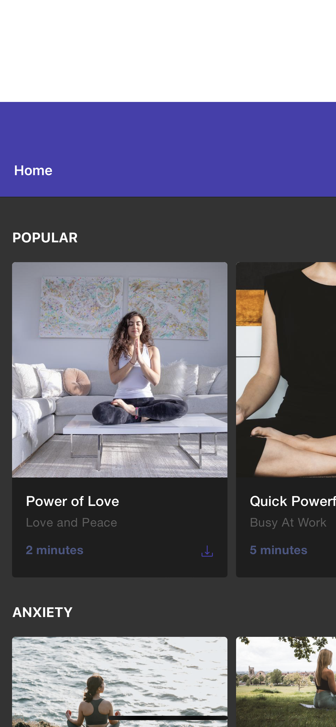 |
Text can be selected by accident, when trying to tap button. Fix: * { user-select: none; } | 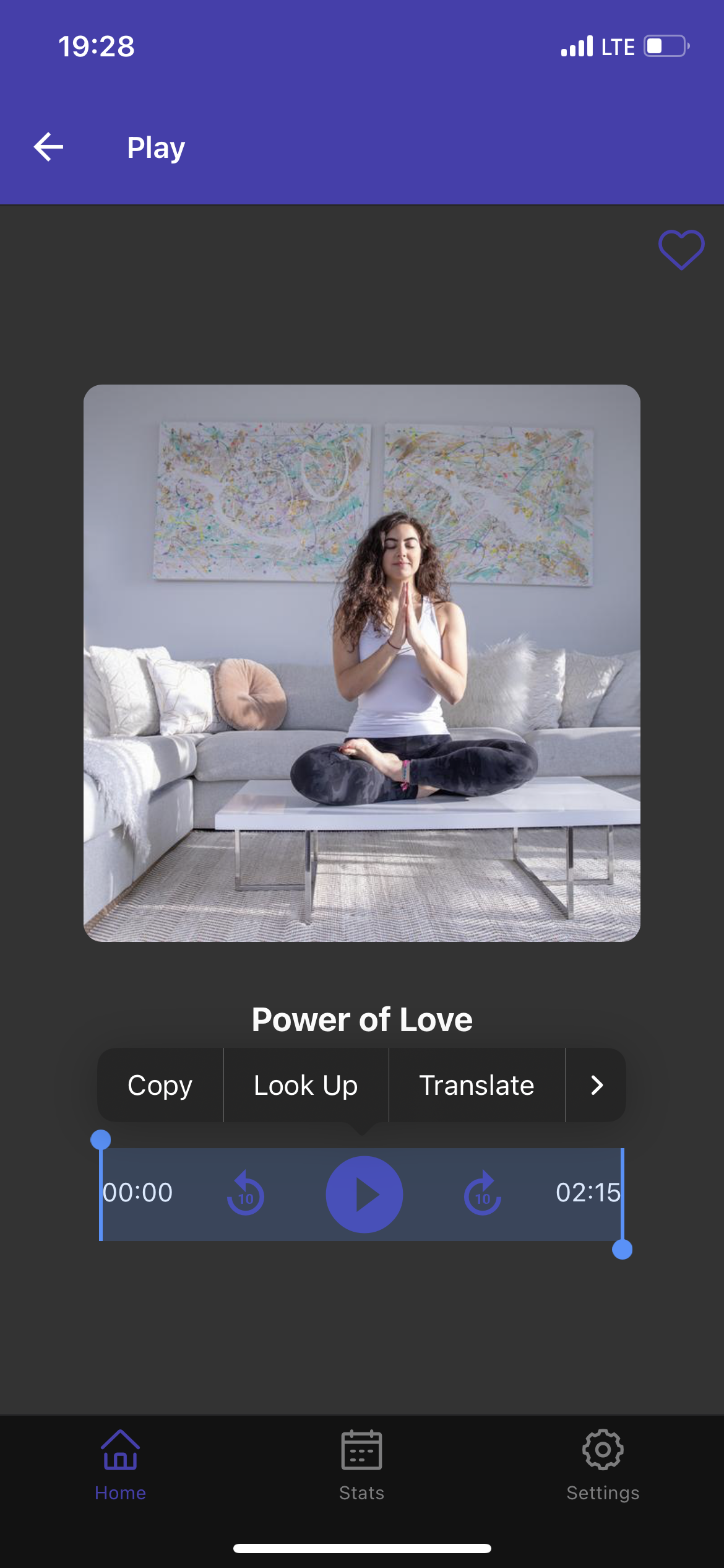 |
Callout Safari actions are not blocked. Fix: html { -webkit-touch-callout: none; } | 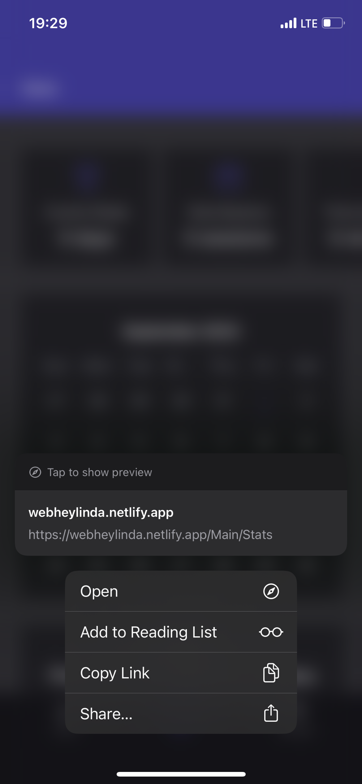 |
| There are no smooth transitions/animations. I expect that this screen would slide out from right. And there is no gestures support - I expect to be able to swipe this screen to right, to get back to main screen | 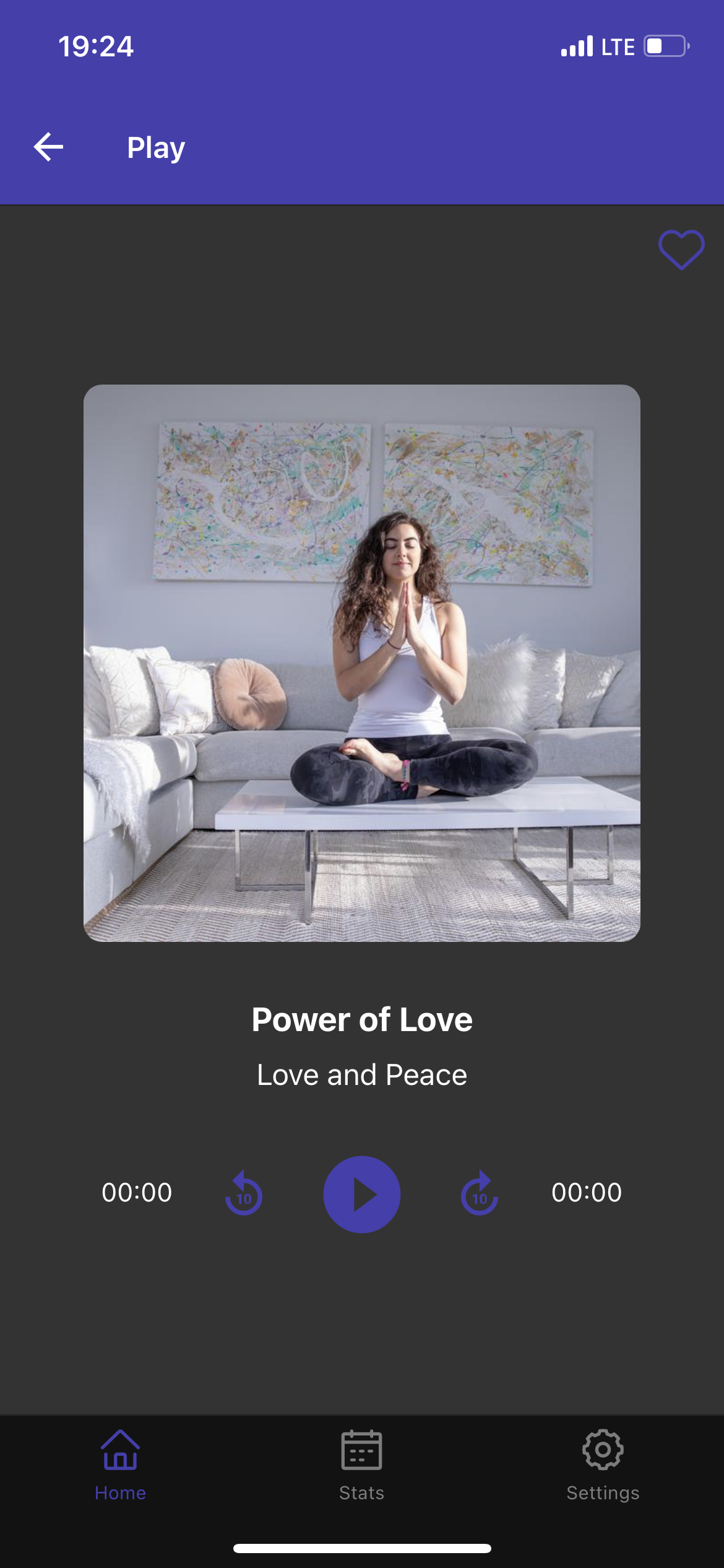 |
Landscape orientation #
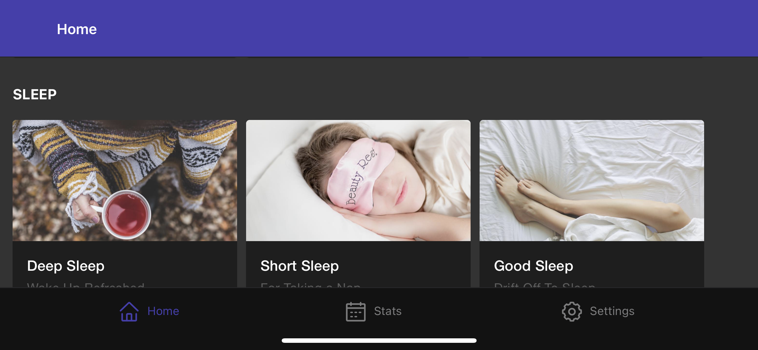
You can’t see it on screenshot, but there is “notch” which covers left part of the screen. Either landscape orientation needs more work, or it should be locked potrait mode.
Read more: Native-like PWA, react-native-web with Vite