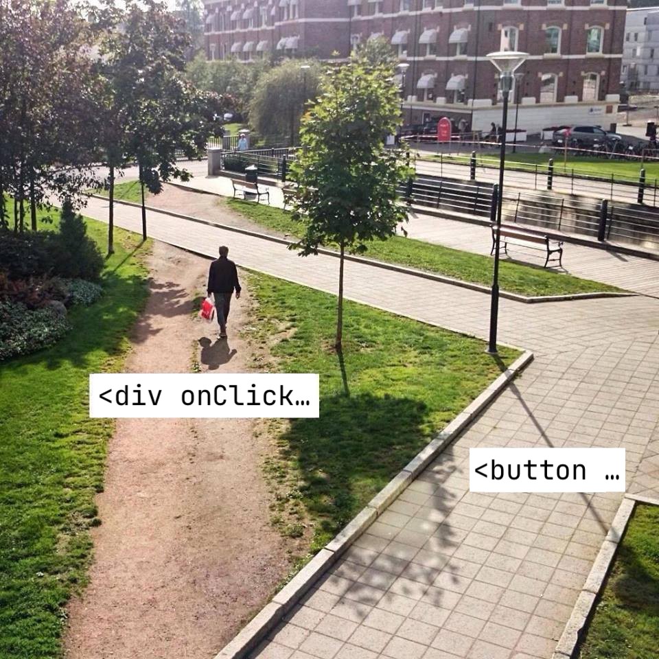
Stop choosing DX over UX. Or maybe not?

Table of Contents
Stop choosing DX over UX.
By no means I want to dunk on Devon. This is just an example of sentiment flowing around the internet. So you, reader, would understand where I coming from.
DX - developer experience. UX - user experience, usability.
Let’s talk about button #
Using <button> instead of <div> for a clickable elements is a good for UX (and accessibility). Yet a lot of front-end developers keep using divs or spans or something else. Why is that?
My guess is that because it is much easier to work with div then button, because div doesn’t have built in styles. Developers taking short cut here, and probably unconsciously, selecting better DX.
If using button would be as easy as using div, I guess a lot of people would use it. Maybe if we would thought about DX in the first place, UX would be better, because developers would have more time to spend on solving actual user’s problems instead of fighting with tooling and lack of standard libraries?
The code #
If you wonder how hard it can be to use button <button> instead of <div>. Here is the snippet with “CSS reset”, which removes all quirks from the button:
import styled from "styled-components";

if (typeof document !== "undefined") {
  // https://alxgbsn.co.uk/2011/10/17/enable-css-active-pseudo-styles-in-mobile-safari/
  document.addEventListener("touchstart", function () {}, false);
}

export const focusRing = (color: string = "blue", inset?: boolean) => ({
  /* Remove excess padding and border in Firefox 4+ */
  "::-moz-focus-inner": {
    border: 0,
    padding: 0,
  },
  ":focus": {
    outline: "none",
  },
  ":focus-visible": {
    // https://css-tricks.com/platform-news-rounded-outlines-gpu-accelerated-svg-animations-how-css-variables-are-resolved/#rounded-outlines-are-coming-to-firefox
    "box-shadow": inset
      ? `inset 0 0 0 3px ${color}`
      : `0 0 0 2px #fff, 0 0 0 5px ${color}`,
  },
  transition: `box-shadow 100ms ease-in-out`,
});

/**
 * reset built-in styles of a button https://css-tricks.com/overriding-default-button-styles/
 *
 * Don't forget to provide styles for:
 *
 * - default state
 * - `:hover`
 * - `:active` (See also https://bugzilla.mozilla.org/show_bug.cgi?id=68851)
 * - `:disabled`
 * - `:focus-visible`
 *
 */
export const BaseButton = styled.button`
  ${focusRing()}
  display: inline-block;
  border: none;
  margin: 0;
  padding: 0;
  width: auto;
  overflow: visible;
  background: transparent;
  /* inherit font & color from ancestor */
  color: inherit;
  font: inherit;
  text-align: inherit;
  text-transform: inherit;
  /* Corrects font smoothing for webkit */
  -webkit-font-smoothing: inherit;
  -moz-osx-font-smoothing: inherit;
  cursor: pointer;
  :disabled {
    cursor: default;
  }
  /* Corrects inability to style clickable input types in iOS */
  -webkit-appearance: none;
  user-select: none;
  touch-action: manipulation;
  -webkit-tap-highlight-color: transparent;
`;

BaseButton.defaultProps = {
  type: "button",
  // @ts-ignore https://developer.mozilla.org/en-US/docs/Web/HTML/Element/button#attr-autocomplete
  autocomplete: "off",
};
Source code on the Github. My previous post about button.
Links in the code:
- Enable CSS active pseudo styles in Mobile Safari
- Rounded outlines are coming to Firefox
- Overriding Default Button Styles
- Bug 68851: HTML buttons should go :active on keydown (spacebar) (opened 21 year ago)
- button autocomplete
What to do? #
If you have components library in your company, add BaseButton to it. And your team can follow the best practice easily:
- const MyButton = styled.div` ... `
+ const MyButton = styled(BaseButton)` ... `

- <div onClick={...} />
+ <BaseButton onClick={...} />
A bit of DX may improve life for developers and users.
Read more: React hook to select multiple items with a shift, React hook to persist state of a dialog in URL